
Overview
Overview
For this project in particular I was approached to create a logo that would represent the brand of a local taphouse. They wanted something modern, while staying true to the area in which it calls home. I worked closely with the team at the Taphouse to help come to the best design for them.
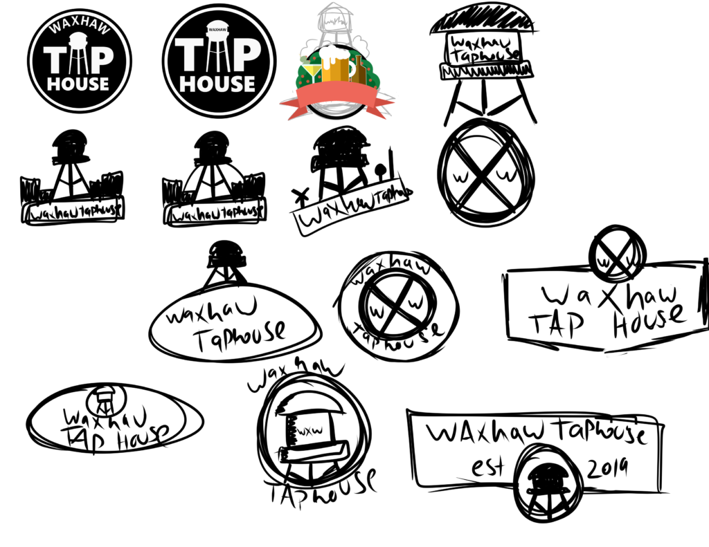
The team at the taphouse wanted to be involved with the design process every step of the way, and this included the skethcing phase. I came up with a variety of different concepts and ideas, and showed them what I had come up with. They asked me to tweak and revise a couple ideas and came down to two they liked the most.
Part 1: Townscape
The first concept they wanted to visit was the townscape idea. Essentially this concept was to have a logo with a townscape coming out of the top of it.
First thing I wanted to start on was to nail down a font that would fit the brand. After coming down to a Font we both agreed on they wanted me to try something with one of the letters which you can see here.
Next came the townscape itself. I designed the townscape to match that of the namesake of the taphouse, Waxhaw. Waxhaw is a quaint little town with a very unique downtown area. I tried to apply this to the townscape concept. After all was said and done we decided to move into another direction.

Part 2: The Circle Icon
After coming down to a Font we both agreed on they wanted me to try something with one of the letters which you can see here.
The first version we discussed some minor changes and tweaks to the design.
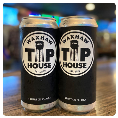
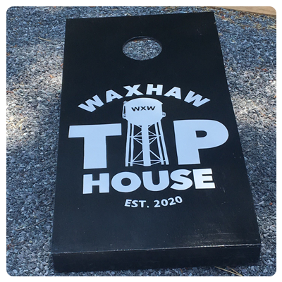
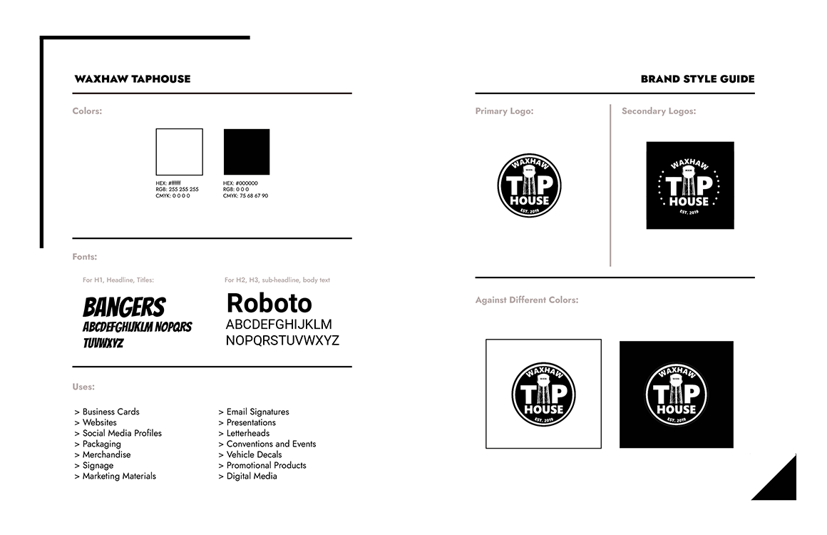
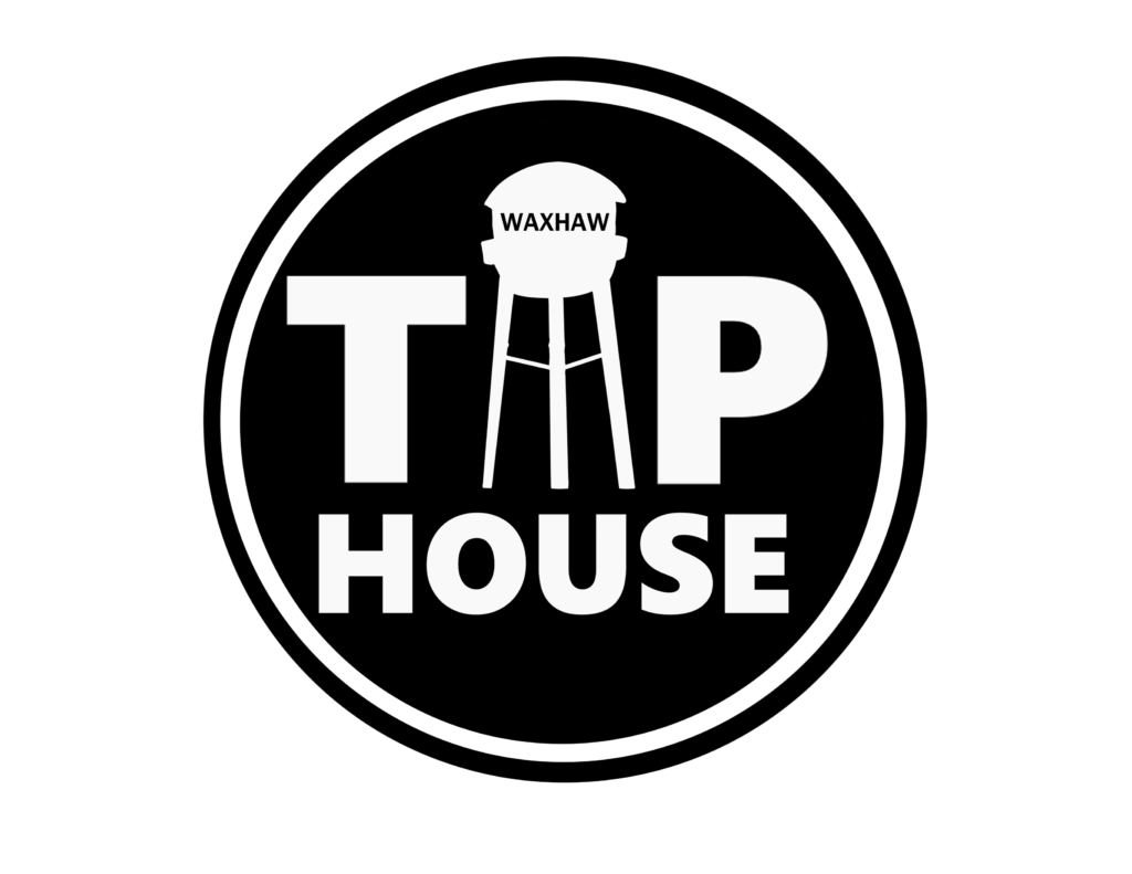
And after much discussion we came to a design that we all agreed fit the style and tone of the establishment perfectly. Using the water tower as the ‘A’ has now become a sort of mascot to the company and is something incredibly iconic in the town.
Conclusion
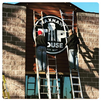
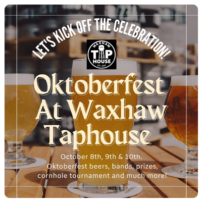
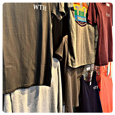
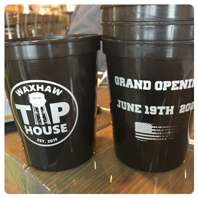
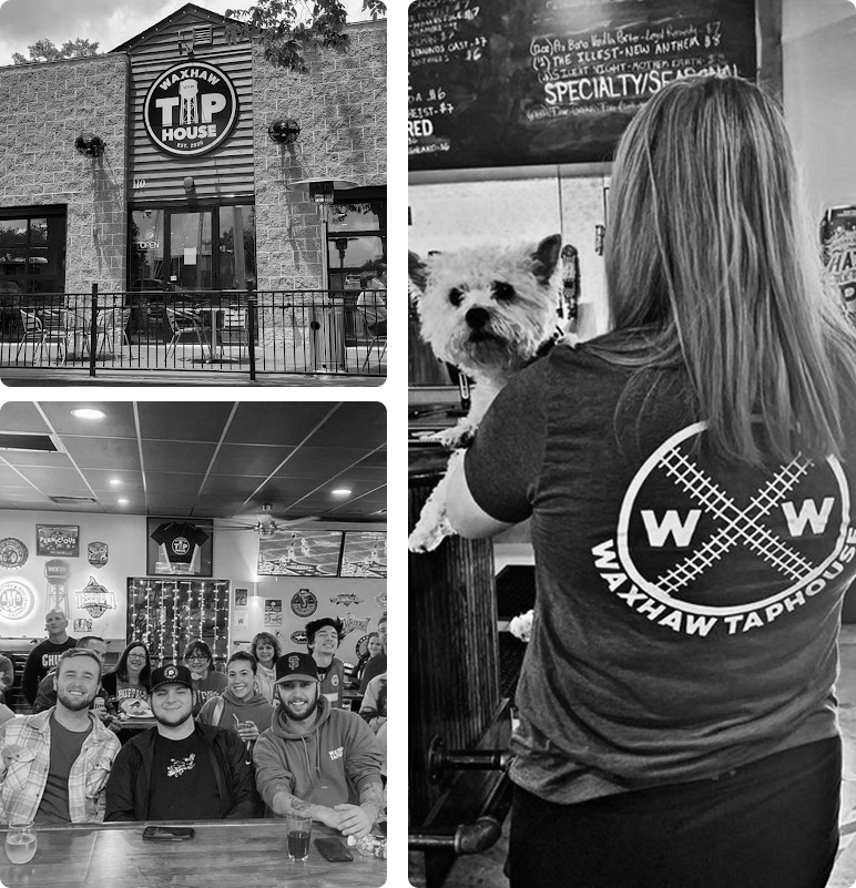
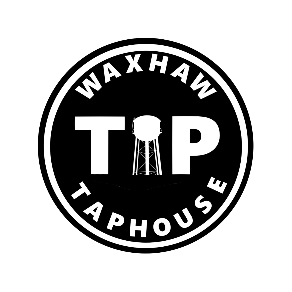
When we came up with what would become the final design we thought one small detail was missing, and this detail was the establishment year at the bottom. After this missing piece of the puzzle was added, we were left with THE design. This is the design used today at the Taphouse, and it is visible on the sign, t-shirts, glasses, floor mats, you name it! The taphouse has since become a staple hang out spot of the town and hosts plenty of events weekly.

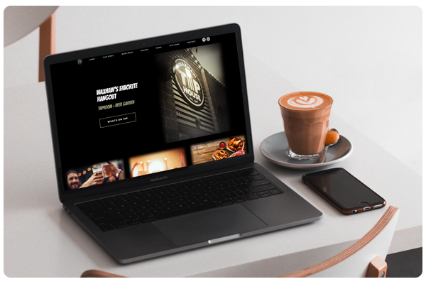
Taphouse Website
On top of print materials of course the business would need a customer facing website to give any information a pending patron might need to know. If you would like to learn more about the website please click the link below: